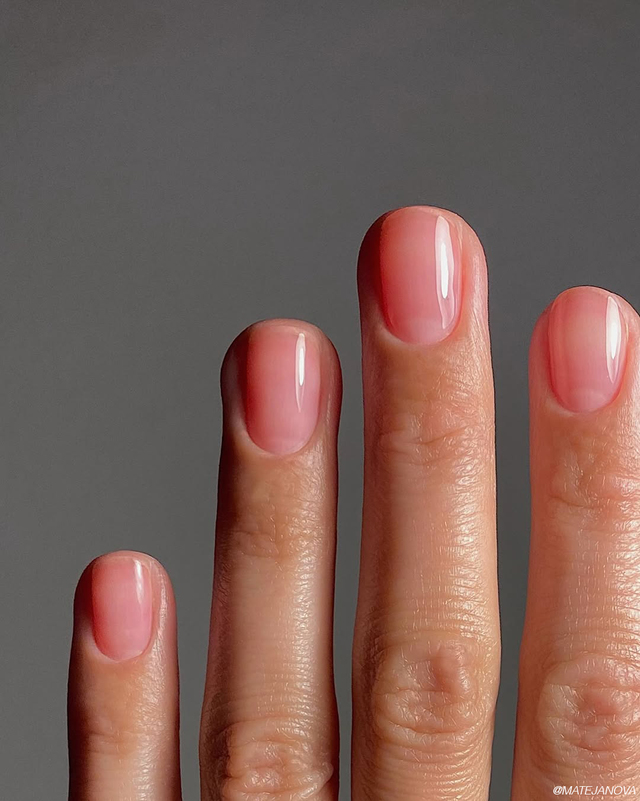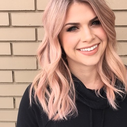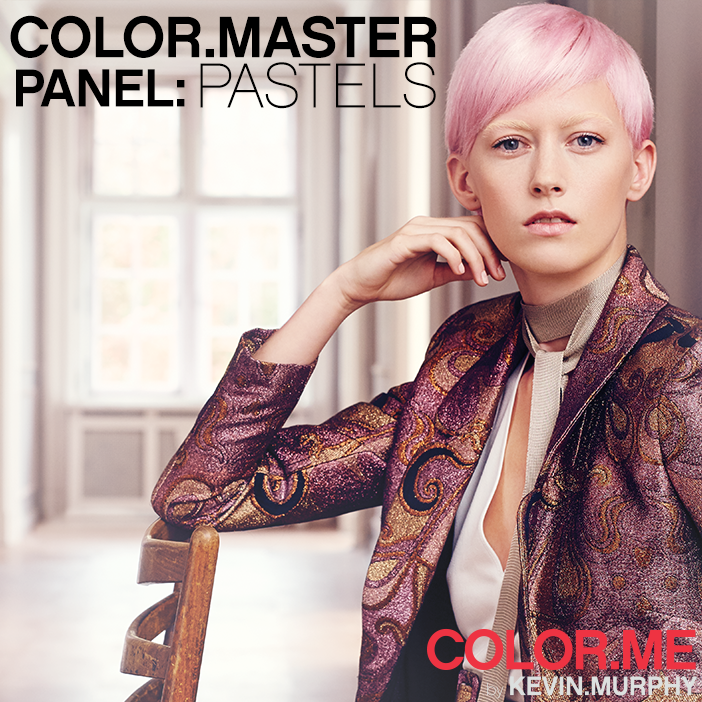
We’re on top of one of the hottest trends this season: pastels. From celebrities to supermodels, we’ve seen this soft yet bold colour trend spreading like a crayon-coloured wildfire, and we’re all about it. In honour of this dreamy colour palette, we gathered some of COLOR.ME’s top educators to talk all things pastel.
MEET THE PANEL
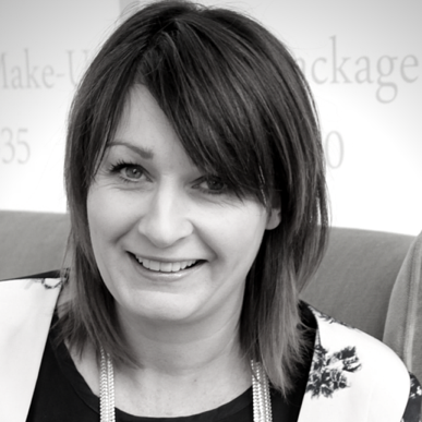
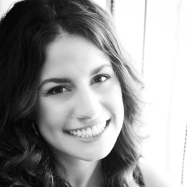
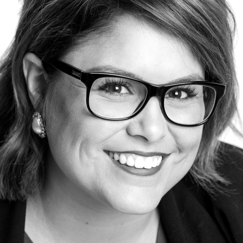
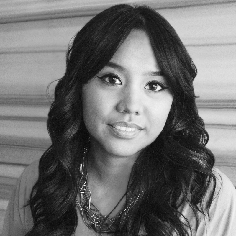
Janine Simons Stephanie Paschke Courtney Anne Cochran Jan Patanao
What do you love about pastel hair?
JANINE: Pastel hair is youthful, playful and pretty! I love that pastel colours have the ability to look beautiful on any skin tone - peachy golds look amazing against warmer skin tones, and icy pinks or baby blues look stunning on cooler skin tones.
STEPHANIE: I love that pastel hair colours allow clients to express their creative styles without completely altering the hair. Pastels are quite versatile and flexible; they provide such a beautiful impact, but are also easy to remove from the hair once the client is ready for a change.
What are the hottest pastel shades this season?
JANINE: Peach and rose gold are really popular this season, and look amazing when blended or marbled using varied levels and tones in similar pastel hues.
JAN: I’ve been seeing a lot of apricot, rose gold and coral quartz shades this season. Mint is also quite popular, and the grey trend is still very much in. Grey has evolved into shades of smoky lavender, cool denim and ice blue.
Who can pull off pastels?
STEPHANIE: I think anyone who has a fashion-forward style and who loves to add a little playfulness to change up their look can pull off pastels.
JAN: It’s not so much about who than it is about how pastels are worn, and they must be worn with confidence. This, tied in with their wardrobe and makeup, complete the overall look. The key to pulling off this trend is all in how it is placed and executed. The women who are more conservative will likely want something subtler, like a foilyage in a muted shade. On the other hand, the trendy fashionista will usually opt for an all-over application in bolder shades.
What is the secret to maintaining pastel hair?
JANINE: I recommend visiting the salon every 2-3 weeks for a COLOR.ME glossing service to keep your pastel colour looking fresh and shiny, alongside a great at-home hair care regimen including RE.STORE, which is rich in antioxidants and will help prevent your colour from fading while improving the condition of your hair.
JAN: Investing in a colour safe wash and rinse will make a huge difference. I recommend washing with cool water to avoid fading and bleeding. You can also stretch the time between washes by using a dry shampoo like FRESH.HAIR, which will help extend the durability of your colour.
Which celebrity pastel manes do you like most and why?
JANINE: Katy Perry, Nicole Richie and Grimes all look great with their ever-changing pastel hues and healthy looking hair. I also loved Kylie Jenner’s Coachella 2016 rainbow braids and all-over peach colour, which are great examples of how you can change up your look on a daily basis or for an event.
COURTNEY ANNE: I always say that Kelly Osbourne does pastels right! She has been rocking this look longer than anyone else and she always opts for the perfect shade of pastel to complement her skin tone and facial features.
Any secrets for formulating pastels?
COURTNEY ANNE: I like to think of my 11.0 as my bucket of white paint, where I can make any pastel colour I want when I drop my chosen reflect into this ‘bucket of paint’.
JAN: I think the key to formulating pastels successfully is knowing the colour wheel to understand the relationship between colours. This has opened so many doors for me to work creatively and formulate new colours. To ensure durability when creating pastels, I recommend utilising shades that are adjacent, or side by side on the colour wheel. For example, if I were creating an apricot look using a shade with a copper reflect, I suggest adding some red into the formula. Or if I was creating lavender using violet, I would add blue - just enough that it supports the shade you are trying to create without overpowering the desired reflect.
Any secrets for application techniques for pastels?
JANINE: Using STAYING.ALIVE as a pre-application porosity filler is a must to get an even pastel tone. For the best results, I recommend drying STAYING.ALIVE into the hair prior to your pastel colour application.
JAN: The key to achieving a successful pastel shade is to pre-lighten the hair enough in order for it to reflect the desired tone. When lightening the hair, I suggest doing it slowly - in stages if necessary. This will provide a more controlled lift, while respecting the integrity of the hair. Trying to lighten too quickly can damage the hair and compromise the durability of the colour. I love using our POWDER.LIGHTENER EXTRA LIFT as it leaves the hair healthy while providing fantastic lightening with no warmth.
What are some of your favourite pastel formulas using the COLOR.ME range?
STEPHANIE: One of my favourite looks is gunmetal violet. To create this shade, I mix 11.0 with 11.1, 5.8, CLEAR and SOFT.VIOLET. Another on-trend hue is peachy rose gold. To achieve this beautiful shade, I take 11.2 and mix it with 11.0, 7.66 and 8.34.
COURTNEY ANNE: For a light baby pink hue, I like to mix 11.0 and 8.66 with our CREAM.ACTIVATOR 10 VOL. If you’re looking to create a soft peach, I suggest mixing 11.2, 8.4 and YELLOW BOOSTER with our CREAM.ACTIVATOR 10 VOL.
What inspires you when creating pastel shades?
JANINE: Colours of nature inspire me the most when creating pastel shades. In particular, I am most inspired by the look of the night sky in the early evening over water. I like to create the look of movement and shine in the hair with fine-tuned colour placement, often using a two-step application process where I apply an all-over colour first, and then paint on my chosen pastel shades as accents.
COURTNEY ANNE: I’m really inspired by all the colours in the sky during dusk and dawn, and I love to marvel at how the colours change. This gives me the most inspiration when I’m formulating my pastel shades!
How can you rock the pastel trend if your workplace does not allow wild hair colours? Is there a subtle way to wear the trend?
STEPHANIE: For people who work in more of a conservative setting, I always suggest blending pastel accents into their current colour by adding subtle pieces throughout their hair or by incorporating a few wisps of soft pastel lights to their fringe.
COURTNEY ANNE: One of my favorite things to do for clients who aren’t allowed to wear pastel colours in the workplace is to colour a few clip-in extensions with their desired pastel hues. This way, they are able to take the colour out for work, but will still be able to put them in when they are heading out to grab a drink with their friends!
Is there an age limit for who can wear pastel hair?
JANINE: Anyone with an on-trend sense of style looks stunning with pastel hair. Remember Helen Mirren on the red carpet? Beautiful colour looks great on any age group.
COURTNEY ANNE: Absolutely not! I love seeing pastels on all ages from my 7-year old niece with temporary pink colour chalk to the spunky ladies sporting baby pink to enhance their lovely grey hair. I know I’ll be wearing every colour of the rainbow when I’m in the nursing home causing trouble!
I’m a colourist new to COLOR.ME, what products can I use in the line to create pastel shades?
JANINE: You can essentially mix any of the COLOR.ME shades to create a variety of different pastels. To get the pastel tone of your choice, I suggest mixing CLEAR with a level 9, 10 or 11. The best thing about COLOR.ME is that it allows you to get creative and have fun!
STEPHANIE: It’s amazing that our range offers a depth of an 11. For new COLOR.ME colourists, I highly encourage you to stock up on 11.0’s, along with vivid reflects such as coppers, violets and reds.
COURTNEY ANNE: I think everyone is going to love our new shade, 5.86. It has that perfect amount of violet and red to create beautiful pink violet tones. And of course, don’t forget about your bucket of white paint (11.0)!
JAN: When determining the formula, my suggestion is to think of the shade you want to create, for example blue. I would look at what shades in the COLOR.ME portfolio have a blue reflect - in this case that would be 1.11. The next step would be to add a small percentage of 1.11 into a lighter shade such as 11.1 in order to make it more pastel. Think of your lighter shade as a bucket of white paint. As you add it to the darker shade, it dilutes it. The more you add, the more pastel your darker shade becomes.
For more information on COLOR.ME be sure to stalk them on Bangstyle and check out their other social media! @colormebykm