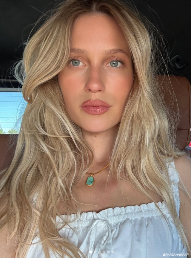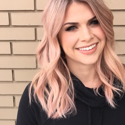
Daylight savings is just around the corner and although the weather still says “winter”, the change in daylight and the latest email marketing campaigns landing in our inbox are gearing us up for the spring and summer seasons. Show of hands, who else has been surfing the web for maxi dresses? Before securing your wardrobe for next season, you might want to think about getting your hair ready for the sunshine because just like your bikini bod, when it comes to your summer color you’ve got to start now!
Once you’ve scoured Pinterest and Instagram for the exact shade you’re looking for, next is how to describe what you are looking for to your stylist. Although showing them a picture is your best bet what you’ve also go to do is explain WHY you like that particular image so they can best translate the look you’re going for with your individualized style. Keep reading to help close the gap between desired style and outcome.
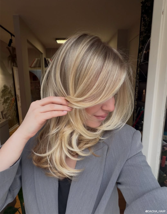
Base Shade
The number one thing clients tend to forget to take into account when picking images of what they want are the base shades. They may see a beautiful highlight or balayage and fall in love with the color of the highlights without noticing that the person has a base shade that is lighter (or darker) than their base level.
Depth & Dimension
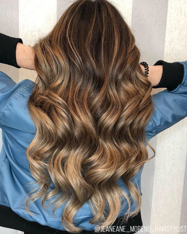
When it comes to highlights, you might thing bright is best and more is better, but the exact opposite can be true. To create depth and dimension, you need contrast within your color. If your client is looking washed out, this is oftentimes why but it can be remedied by adding lowlights to their look.
Placement
Ombre, sombre, babylight, teasylight? There are so many distinct ways these days to place highlights it can almost be dizzying. For a complete guide to what each of these is, be sure to click HERE. During the consultation, this should be heavily discussed because more than anything else clients will notice where their color lands. Placement can make such a difference when it comes to face shape, hair cut, layers, and styling.
Tone
Warm or cool? Tone comes in all kinds of packages and can be cocktailed to offer a plethora of new creations. While red is an obvious warm tone and blue is an obvious cool tone, things tend to get tricky when determining shades like gold, ash or beige. To the naked eye, gold wouldn’t appear warm to most, but it is. And “ash” is an obvious cool tone to stylists, but can sometimes be seen as grey or green to clients. The best way to understand the difference is to show clients with side by side comparisons, perhaps with a color chart or by keeping images handy at your station.
To know which color family is best for your skin tone, click here.
For more updates, product releases and more from Matrix be sure to sign up for our newsletter HERE!