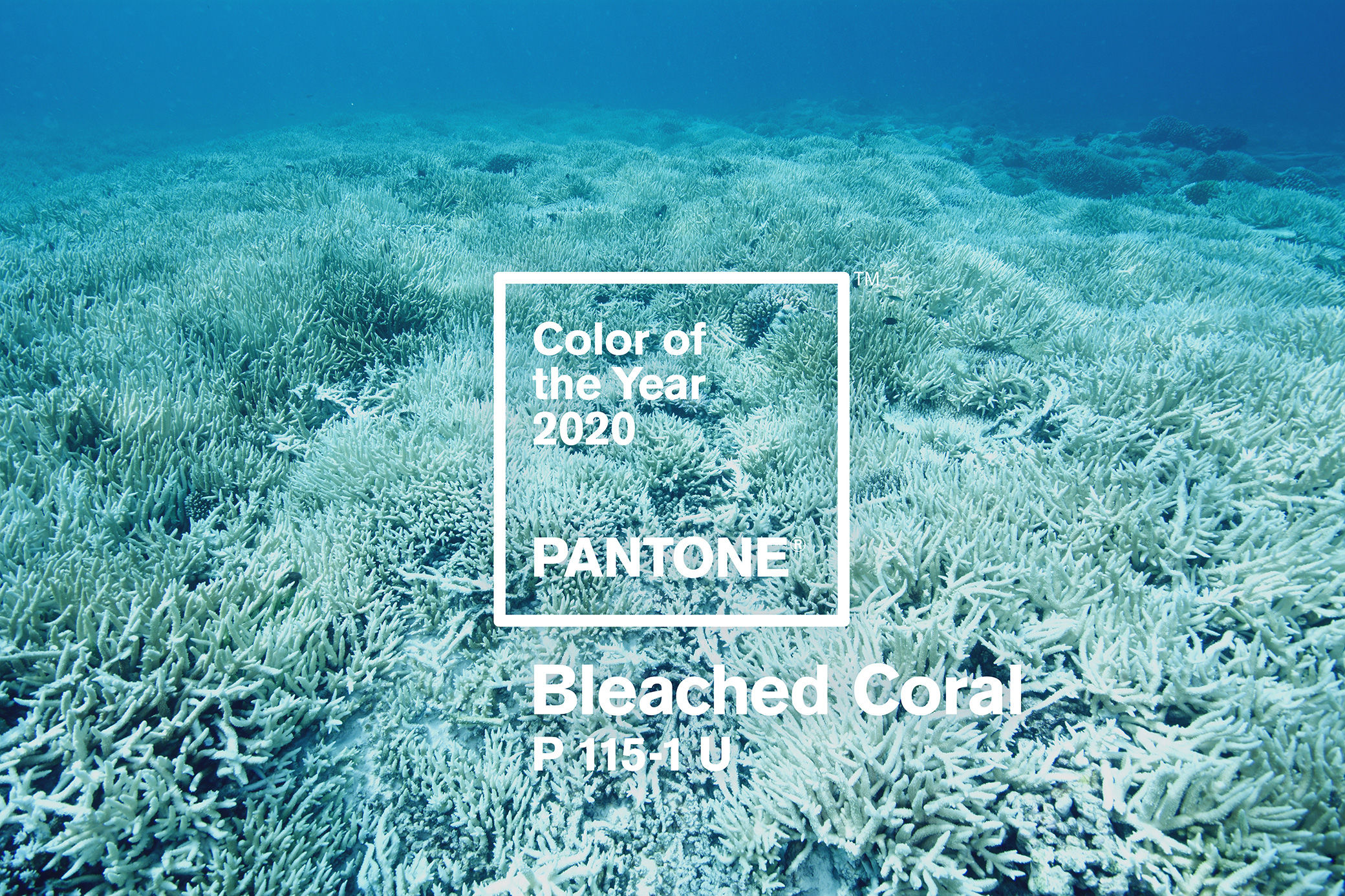
*With the recent release of the Pantone Color of the Year 2020 being Classic Blue, we did some digging and realized that our original announcement - Bleached Coral - was actually a ruse created by Jack Railton-Woodcock and Huei Yin Wong, a creative team in Melbourne Australia who wanted to bring awareness to the plight of our oceans and how out of touch "Living Coral" as a tone was to the current state of affairs. However, we still find it important to share with you this story, the shade, the idea, and the meaning behind it in an effort to raise awareness for global warming and the disappearance of our coral reefs.
As we get closer and closer to 2020, we think it is important to start thinking about the PANTONE Color Of The Year – Bleached Coral. Making quite the statement, how will you embrace this shade? With 2020 just over 1 month away, we're realizing society is becoming even more aware of time, what this hue means for us individually and in relationship to our planet.
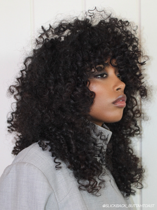
2019 was about celebrating Coral Reefs and with the 2020 Pantone Color Of The Year, they are bringing awareness to Coral Bleaching. They named the slightly blue off white color this season – Coral Bleaching – which is actually taking place at an alarming rate due to the rise in water temperatures. With widespread awareness for places like The Great Barrier Reef (which is dying off at an alarming rate), it is important to realize that coral is dying off all over the world as well.
Pantone has a platform to influence the creative community all over the world and bring awareness to topics that go far beyond design. With some backlash after last year’s lackluster choice, they wanted to stand on solid ground this year. When describing the new shade, they took a slightly satirical, slightly sinister (in the best way possible if you ask me) approach to the description.
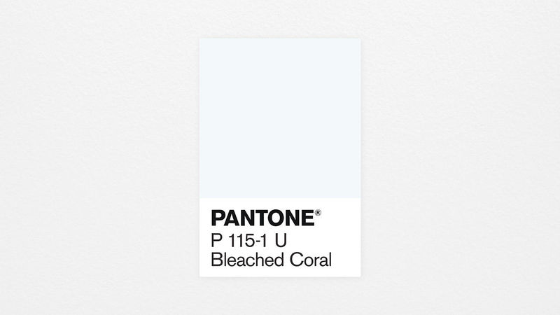
PANTONE P 115-1 U Bleached Coral
“Somber, yet uncomplicated, PANTONE P 115-1 U Bleached Coral harkens back to a simple time. The subtly inoffensive hue offers a harsh reminder of how quickly things change, with a comforting greyscale undertone that reinforces the inevitability of time.
Representing the fusion of modern life with the natural world, while straddling the fine line between hope and despair, PANTONE Bleached Coral asks the age-old question-where did it all go wrong?”
Hoping this will have a trickle-down effect, they are taking a stab at their own community, begging everyone to bring awareness and to make a change.
There is no doubt about it, sustainability and eco-conscious practices are entering the limelight at an alarming rate and we couldn’t be more excited to see the brands we love most standing behind the cause.
Effectively, taking care of the environment is “cool” and as producers and consumers, it is important to tell the story not just of trends but also the movements. Enter the fashion world, Stella McCartney has forged the path of sustainability and continues to champion the efforts. From the choices she makes on the runway to production and the statements (about not washing your clothes) in the press. The momentum is gaining and spreading, and we should all do our part to help the process. Think twice about the choices you make and how it affects not only you but the environment and the world we’re creating for future generations.
We would absolutely love to see the ways in which you utilize this shade this season as well as the practices you’re taking toward sustainability in your styles and salons! Be sure to tag @Bangstyle on social media so we can help encourage the cause!