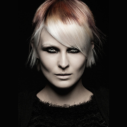
Clients usually come in with the same request each time. They want MORE. They loved what you did last time and as soon as they sit in your chair they want more of the same. They want their hair to be longer (and healthier), blonde to be brighter, and color to be more vibrant. While an obvious action would be to bump the bleach and add more foils, adding darker colors will actually make hair appear brighter. The key to getting a color to stand out this season? Contrast!
From subtle ombres and sombres to smudged roots and dip-dyed ends, clients are craving more dimensional color this season. They don’t just want to be “blonde” or “brunette” they want toasted coconut, brunette brûlée, mocha, living coral and everything in between. As you begin to cocktail your latest shades, be sure to educate your clients about a key process you’ll be completing – adding lowlights.
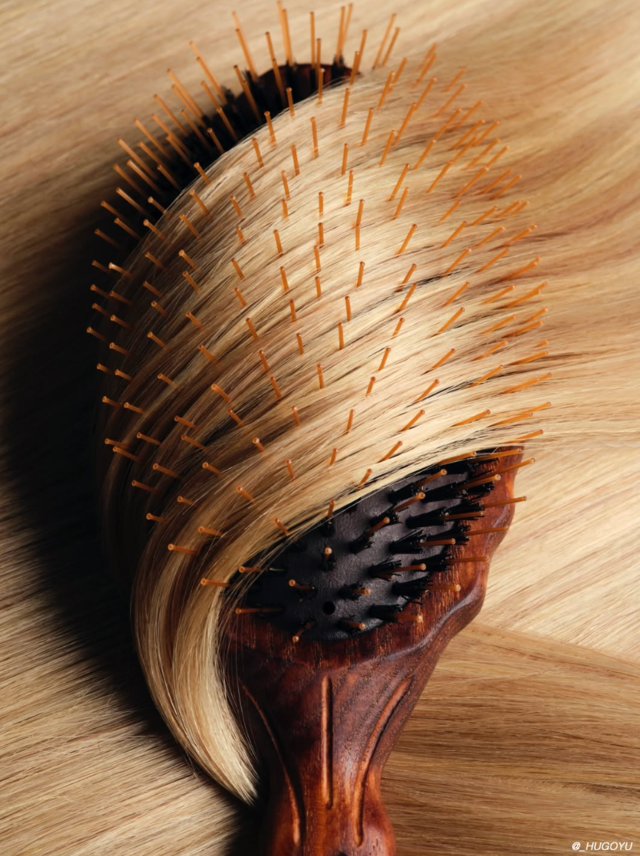
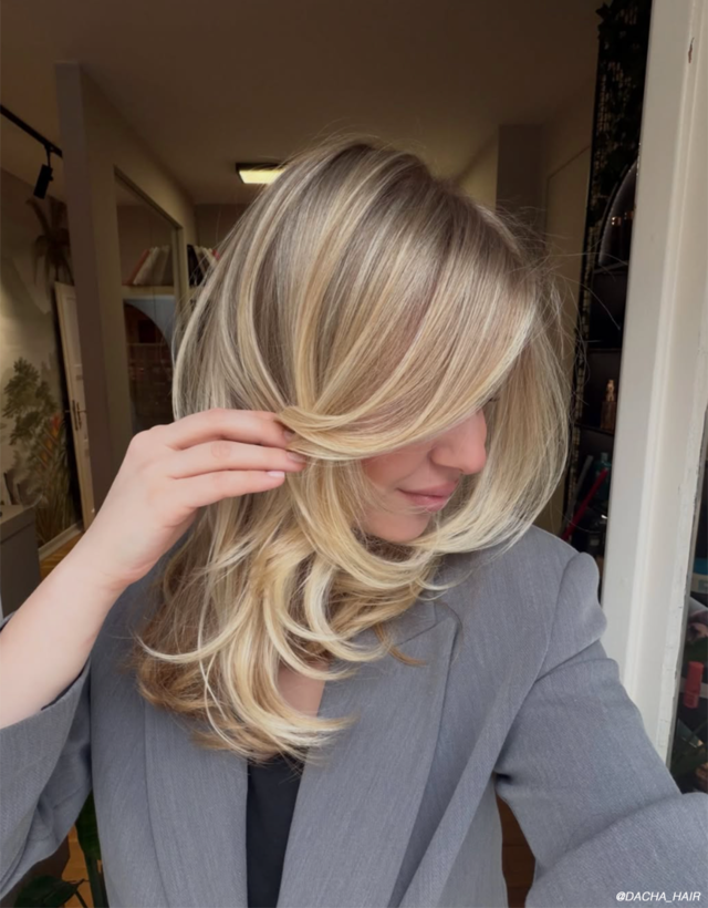
The Suggestion: Lowlights
Lowlights are just what they sound like. They are a darker shade placed within highlights to add dimension. They also add movement to existing layers and can even make skin and eye tone appear more robust.
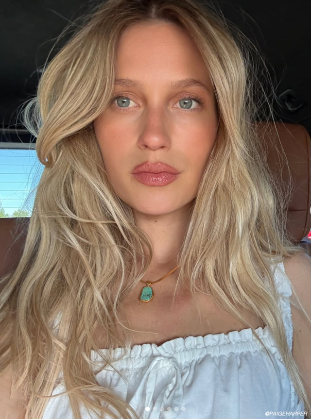
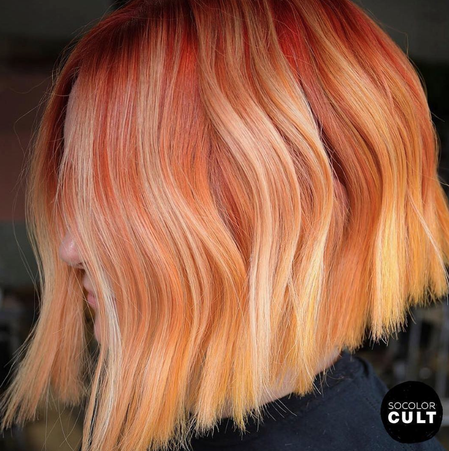
After a few rounds of highlights going lighter and brighter, hair can oftentimes look washed out. Even if your client wishes to be Gaga platinum, you’ll need to add something else to the mix. The truth of the matter is that by strategically placing darker shades, blondes, brunettes, redheads, and even fashion shades will appear lighter and louder! By giving shades a contrasting palate to stand out from, it makes their color look that much better!
The Suggestion: Contrasting Fashion Shades
When working with fashion shades, you’ll have to think about more than just levels. Looking to contrasting shades of the color wheel will help balance tone and add range to your finished look.
A few of our favorite combinations:
Pink + Purple
Not only do we love this variation on pastel varieties, but fantasy shades as well. In this creation by @makeupbyfrances she utilizes purple at the root, which works well for clients with darker levels and pink + orange throughout the mid-lengths to the ends. The addition of neon orange to the pink is what creates the well-rounded dimension, while purple creates drama and dimension.
Pink + Orange
Although the more obvious contrast in this creation from @shmeggsandbaconn is the blue and orange, looking closely you’ll see hints of pink throughout the roots. What this does is create shadow and depth in a secondary fashion. It doesn’t stand out to the eye immediately, however, this subtle detail is what brings the entire look together so effortlessly.
Blue + Yellow
Again, it’s the subtle hint of yellow in this creation that brings the blue and green to life. Although minimally placed, it is the touch of light that sets this finished look apart. Looking at color theory, you add yellow to blue to create green, which is why logically these contrasting creations makes sense!
What are your favorite ways to use contrasting shades to get your colors to stand out? Be sure to tag @Matrix on social media so we can see your latest shades!
For more updates, product releases and more from Matrix be sure to sign up for our newsletter HERE!